Chart window
The chart fills the window and the controls float in the corners. Everything between them is chart: a drag there pans, even close to a button.
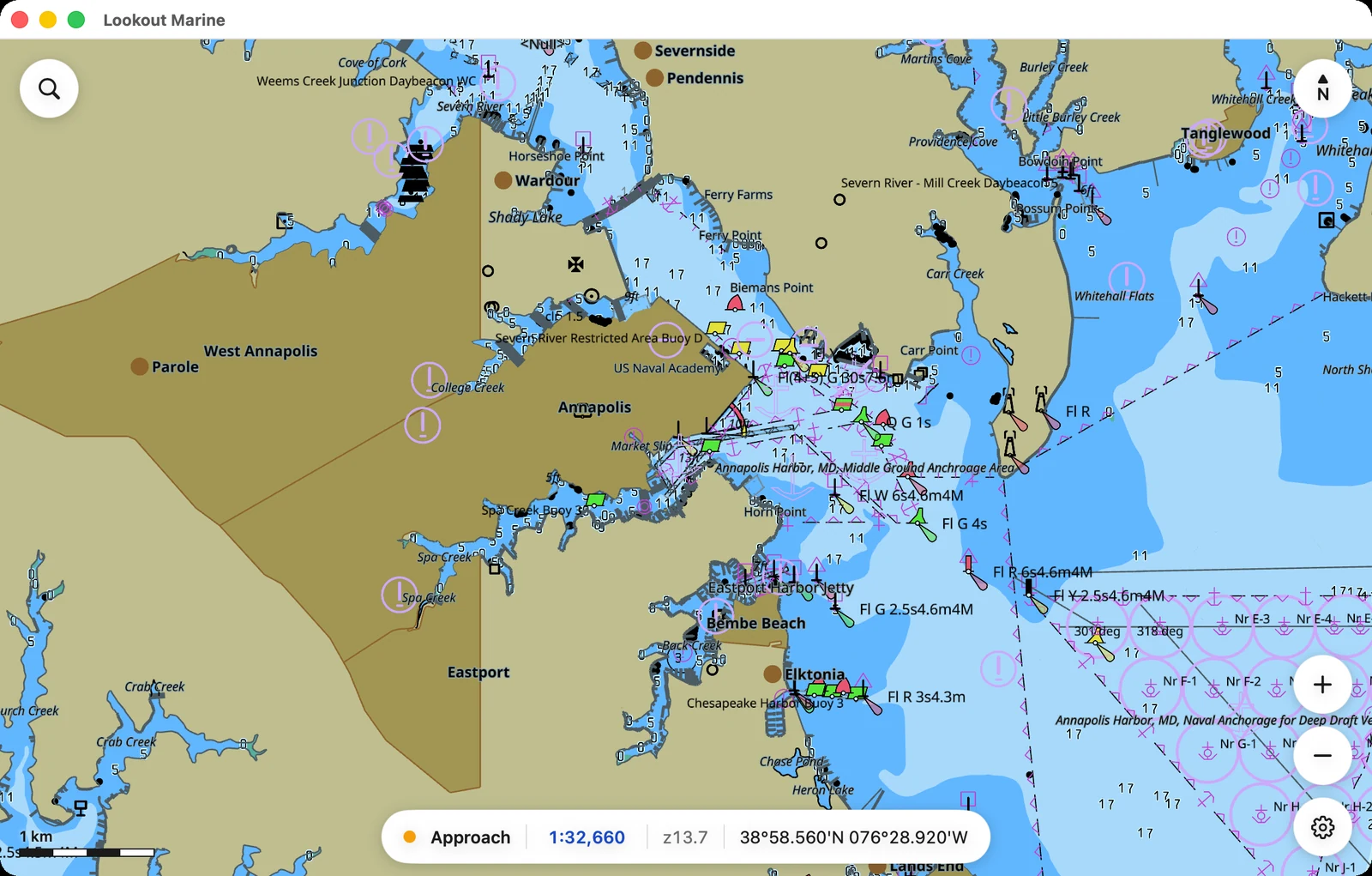
Reading the numbers along the bottom

- Band. The kind of chart you are on: Berthing, Harbor, Approach, Coastal, General or Overview.
- Scale, in blue. Click it to go to a scale.
- Zoom. How far in you are. It is finer than the scale, and it is the quick way to return to the same view twice.
- Position. Under the pointer while you hover, otherwise the centre of the view. A touch screen has nothing to hover with, so a tablet and a phone always state the centre.
- Overscale, in amber. The chart is magnified past its survey.
×1.4means you are looking 1.4 times closer than the data supports. What you see is larger, not more accurate.
A phone hides the band and sets the type smaller. Position and scale always stay.
Using the corner buttons
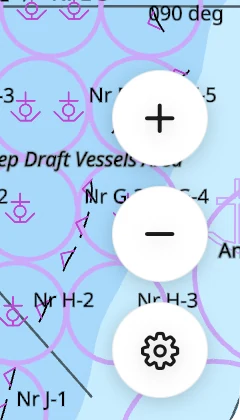
- Search, top left. Go to a position.
- North, top right. It points north as you turn the chart. Click it to square the chart up again.
- Plus and minus, bottom right. One zoom step about the centre.
- Gear, bottom right. Mariner settings.
Judging distance with the scale bar

A round distance at the current scale, in the bottom left corner.
Identifying a feature
Click or tap a feature. The report lists each object under the cursor and the chart cell it came from.
Waiting while the chart loads
The first start prepares the chart symbols and takes a few seconds. Later starts skip that work. While a library opens, the app states what it is doing.
When you pan into new water, a small pill appears at the top. The chart stays live while the new area fills in.